

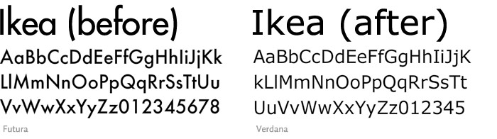
Unless you've been living under a rock (which, let's face it... I have), you probably already know that IKEA changed their font from Futura to Verdana in an effort to streamline their catalogue and website in all languages. And apparently, they got a shitload of complaints about it!
About the use of Verdana, it was said, "It's like taking the family sedan off-road. It will sort of work, but ultimately gets bogged down" ... "It's a bit like using Lego to build a skyscraper, when steel is clearly a superior choice." (via)
Who, I'm wondering, has the time to be complaining about corporate font changes? Are they all bored, frustrated typesetters and font designers who had grown too accustomed to generic fonts like Andale Mono, Helvetica and Frutiger, needing the likes of Futura to fuel their insatiable lust for letters?
(Actually, that sounds like a decent porn title.)

I can just imagine horny designers saying things like, "Oh, please! I couldn't even finish the IKEA catalogue. I had to take a cold shower after the first few pages," and perhaps they would have if I'd bothered to ask any of them. But I still think some sort of intervention is necessary if you have the time and effort to contribute to complaining about the font choice of trendy furniture stores.
I bet if The Brick changed their font, no one would bat an eye.
Apparently, compared to Futura, Verdana is a god-awful piece of shit. A back-of-the-bus, seperate-drinking-fountain, get-your-own-banana font. Whereas, it would seem Futura is a hard-working, upstanding middle-class font who struggles to provide for the little fontlets, losing sleep over how to pay the font mortgage and making sure the font car insurance payments don't bounce.
I don't know about the whole thing. Personally, as accustomed as I am to seeing this:

I really don't care if I have to endure this:

FINAL VERDICT: As long as they continue to sell particleboard media units that take three hours to put together and begin to buckle at their dirt-cheap seams right after you successfully fill them with electronics and carefully selected book like Leading By Design: The IKEA Story, I don't care what font they're using.
They could use Wingdings for all I care.
Wingdings would seem like further illustrations on how to put the thing together.
ReplyDeleteAnd obviously I don't speak for everyone, but I know that, personally, I lost a sense of trust with the new catalog. Before, when things were Futura, I knew exactly what to expect and I liked it. Now, with Verdana, who knows what you're getting? It's so vague and ambiguous, and the only logical conclusion I can come to is that they must be a shady business now. I wouldn't take my children to the store after an act like this. I hope I can sleep soundly in my IKEA bed tonight... or maybe its foundation will break as well.